Magic: The Gathering Online UI Feedback
Wizards of the Coast has released the Beta for the new Magic: The Gathering Online UI for a wider audience! If you’ve ever played [cardboard or online] Magic before, I recommend giving it a shot on the new client. It is a huge improvement on the old one, and has many of the features the players have been asking for over the last decade. As many of you probably know, I’m a User Experience nerd, and I always think I can improve on any UI design. So here’s my unsolicited feedback, as a MTG player of over 15 years and a Magic Online Player of over 7 years.
General Comments
The interface looks much better, but that says very very little. Because the current client has such a poor appearance, people’s expectations are very low. Diablo 2 looks better. Hell, Super Mario World for Super Nintendo looks better in some cases. Just like the current one already appeared very dated and ugly when it first came out years ago, this new client has the same problem. It uses big gaudy graphics that are heavy and slow-loading. The art looks great and has tons of fantasy/magic flavor, but if it causes the client to be slower I’d rather it went away.
If I minimize the main window, my chat windows minimize too. This completely negates the reason why I would want to be able to pull my chat windows out in the first place, and is definitely not intuitive. I’m hoping this is just a bug and not the intended design.
Giving the ORCs (admins) their own chat room was a great idea. It was easy for me to get fast answers to my questions without having to take my eyes off the game I was playing, so kudos for that. See? My feedback isn’t ALL bad.
The Chat drop-down & Buddy Lists feel buggy and confusing. Clicking on Chat, then navigating to Buddies, the list is in some strange random order and I can’t find who I’m looking for. On top of that, I know for a fact that the friend I was looking for is online, but her name is nowhere on that list. There are much more elegant ways to have a hide-able buddy list (one of which is using XMPP so people can login to it with Adium or Pidgin if they want). Having your buddy list on the third level of a rollover/dropdown is very awkward. I will discuss my suggested solutions in the Player Communication section later.
Themes are cool, but where’s Tezzeret?! Every other Planeswalker got one! In all seriousness, it would be nice if we could make our own theme. Hell, you could probably sell premium themes or give them away at events. People buy flashy playmats all the time for cardboard Magic.
Home Area

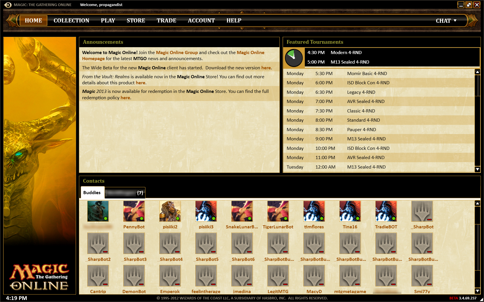
Thousands of pixels of wasted prime real estate. On my screen, it’s roughly wasting 3600 pixels. Sure, the giant picture of the cool-ass dragon looks nice. But you have a game with incredible art already. You don’t need to zazz up the table you’re playing on. You don’t want people to stare at pretty pictures in your interface. You want them to buy stuff from your store, play in events to use up all their tickets and packs, then buy more stuff from your store. Use that space for something useful in achieving those goals. Put the latest featured/sale products there. Promote Daily MTG articles from the website. Just do SOMETHING with it. You can make something that has good form AND function.
Kudos on the responsive design. Having the right content on that home page is all you need to do now.
Don’t push people away from the client if you don’t have to. On the Announcements board, the following text appears “Join the Magic Online Group and check out the Magic Online home page for the latest MTGO news and announcements.” I may not have an insider point of view here, but the design for this home page screams “We can’t think of enough content to put here”. So why not replace the links with the actual content they link to? Put the events calendar where the Featured Tournaments section is now. Put a stream of some of the latest posts or stickies from the Wizards Community MTGO site on there. Use the space as best as you can!
The buddy list is just plain awful. It’s laid out in a way that takes up way too much real estate without adding any real function. The player avatars don’t belong in the buddy list window, especially if they’re bigger than 32×32 pixels. The only reason some chat programs put them there is because they let you upload custom avatars. All they do in this context is force me to scroll more to find the friend I’m looking for. I never go into my buddy list and think to myself “I want to play with Kati, so I’m going to look for the Serra Angel avatar”. I look for her handle alphabetically like a normal human being. Whoever told you that putting a buddy list in a horizontal window was a good idea needs to be fired. I would suggest putting the buddy list in the same place it is on the current/old client, except with the improvement of not having chat in the same area. Allow users to show/hide the frame the same way anywhere on the client, and allow them to pull it out and dock it elsewhere the same way you did with the chat windows themselves. Just make it easy to use and put it where people are most likely to look for it: the right side of the screen.
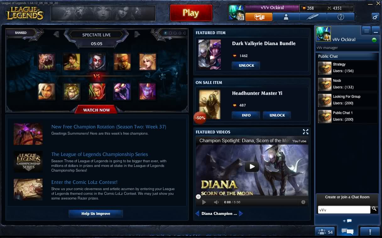
Extremely boring Announcements Board. You took this giant chunk of prime real estate and dropped tiny one-line announcements into it. No graphics, no details, no interaction. Just dry sticky note-style announcements. If you want something that does this, that’s fine. Just make it smaller and put it somewhere less valuable on the screen. But I think a much better option is to put all your sexy artwork there so that people actually want to look at your messages! Look at how League of Legends does their homepage:

They use all of their real estate well. They mention a featured item in the Store. They showcase the latest video they’ve put out. They use an image carousel/slideshow with smooth transitions to display high-level matches you can spectate. Their Announcements board is accessible, readable, and has nice thumbnail images. They even feature professional players from time to time and let users watch them stream. You could EASILY do that with SCG, ChannelFireball, or even your own Daily MTG writers.
The Featured Tournaments widget should be the main thing you push on the Home screen. Making Magic Online as competitive as possible is what will make you money. Either that or the latest promotions in the Store should get top booking on the the upper half of the screen.
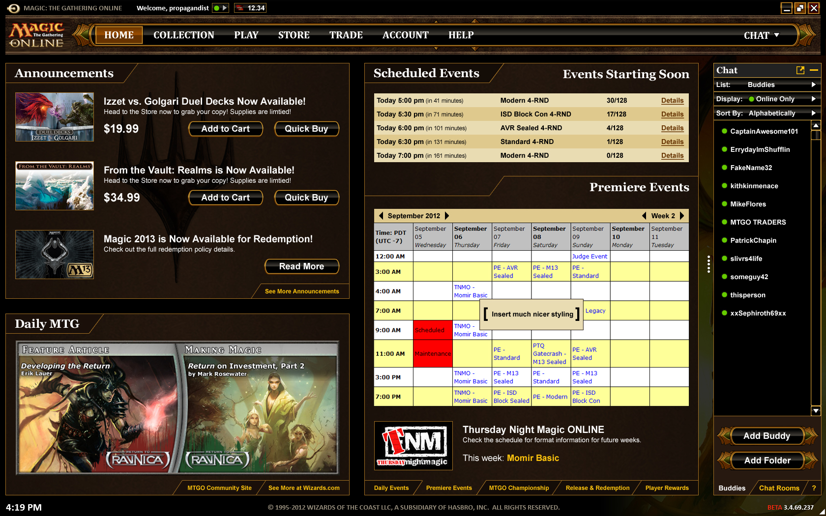
Here is my sketch for how your homepage should look.

Collection
The new Wish List is awesome. It is a HUGE improvement. At first I thought it was just a quick dropbox for adding cards, but then I used multiple decks to add cards I needed from them and I got NO OVERLAP. Maybe I needed to get 4 Restoration Angels for my Modern deck and 3 for another Standard deck, but using the “Add Needed Cards to Wish List” function didn’t put 7 of them in the list. It put 4. Awesome.
I like the Sample Hand & Analysis features, but they aren’t working properly yet. The sample hands are not truly randomized, which kind of defeats its purpose. I’m hoping this is something that the devs are still working on. The deck analysis panel is only marginally useful, but it wouldn’t take much to beef it up with more stats and perhaps making it prettier to make it a home run.
I can’t import my old decks/wish lists into a trade binder. This seems especially silly. Anyone who uses the (admittedly ass-backwards) old way of organizing their trades and wish lists will want an easy way to transition those into the much-improved Binders system.
Creating a deck with the cards shown creates lots of unnecessary lag. When I put a card from my deck back into my collection, why does it have to reload that whole window and scroll it back to the top? It is EXTREMELY annoying when browsing cards alphabetically. I’m guessing that using List View will be quicker when it becomes available, but if you’re going to make Card View the default, you have to make it work efficiently.
Deck Editor Scrolling. When I click on a card that I’ve placed into my deck, the old client would make the “collection browser” area above scroll to that card. This was a useful functionality for quickly adding more of a certain card, that is now missing. There are FAR better ways to do this in general, but bringing back old functionality would be a good band-aid for the short term.
When using the Filters on the left side, it is annoying to have the cards reload each time I hit a checkbox. Could you instead use an “Apply” button so that I can choose all my filters, then hit the button so it only loads only once? Then you can have a little checkbox next to it that says “Auto-Apply” so that people who like it the current way can turn it on and off. Taking these small steps to make the page refresh less often will go a long way toward making deck building faster and more enjoyable.
Player Communication
For any collectible card game, player communication is absolutely the most important element to consider. If players can’t easily trade cards, individual card values drop. If players can’t play quick games with their friends, users will slowly leak from your customer base. If players can’t communicate with each other (and your reps) on the communications channel of THEIR choice, you will see much less communication. With all of these things in mind, here are my suggestions.
Feature Requests
Allow tickets to be traded up to 2 decimal places. Tix = dollars. Everyone knows this. The current system basically just works on the honor system where a player you trade tix for cards to will just keep track of a “store credit” for the difference if it was less than a full ticket. This is very inconvenient for players, and prevents me from wanting to use the Marketplace at all.
Let the client keep track of each player’s tickets at the top, where the username is displayed, then if the user clicks it it takes them to the store where they can buy more tickets. Keeping them in the Collection tab is absolutely absurd. I don’t keep individual dollar bills in my trade binder when I play paper Magic.
Keeping track of tickets as currency is not a new concept. It’s being honest about what they truly are and providing users with functionality that matches it.
CHATTING
This is probably the area that needs the most help on the entire client.
Lists:
- Buddies
- Bookmarks (bookmark sellers in the Marketplace you prefer)
- Recent Contacts (New Feature that keeps track of players you recently played, chatted or traded with)
- Block List
- Clans
Display:
- All
- Online Only
- Offline Only
- Looking for a Game (New Feature that shows when you’re hosting or browsing for a game)
- Playing (possibly with a spectate link for casual games)
Sort By:
- Alphabetical (A-Z) / Reverse Alphabetical (Z-A)
- Status (online/offline/playing/etc.)
- Search (New Feature that allows you to type into a search box and have the buddy list narrow down its contents based on what you enter)
Buddy List Folders
Let players organize their buddy list into folders. I would use it to make the following folders for starters: “Marketplace” “Real Life Friends” “Commander Buddies”. It would help me keep track of which members of my list are trading bots, for one thing. Your Clans could fit into the same kind of folders.
More Accessible Notifications. The new notifications that pop up on the bottom-right are awesome, but I’d like to see an area that keeps track of them in case I miss one. It would also be nice if there were a user-friendly way to customize what you get notified about.
The Battlefield
Once the player finally gets into a game, it should feel as much like playing on their kitchen table as possible. The new client has taken huge strides in this area, but isn’t quite there yet.
When playing Commander, why is the Command Zone directly in the middle of the play area? It’s really confusing and annoying. I have no idea whose commanders are in play. At least let me move it somewhere else.
Make /eject more accessible. Many players (especially in the Just For Fun rooms) don’t even know how this option works. If I right-click on a player’s name in the chat window of a multi-player game I’m playing, it shows Send Message, Trade, Block, etc. but no Eject. Add it in there please. It is a VERY common necessity in casual multi-player games.
In multiplayer games, I can’t tell who each creature is attacking. I used to be able to rollover each creature with my mouse and see a big arrow pointing toward whomever it’s swinging at. Now that we have the super cool redzone, can we [shrink/minimize/grey-out/move to the side] all attacking creatures that AREN’T targeting you with their attack, then put the ones that are dead center? I just want something that I can see right away (ideally without rolling over) what’s attacking me. Commander games often involve dozens (if not hundreds) of creatures attacking at a time, so it would help a lot for those Insurrection alpha strikes.
Can I right click on my attack phase and have an option that says Attack with All Creatures? My token decks will thank you.
Infinite Combo loop Shortcuts. I can’t play Kiki-Jiki decks online the way I can in real life, because infinite combos often run directly into the strict time limits before they can kill someone. It’s also REALLY annoying to have to stack the same triggers over and over again for the same repetitive action. Can we perhaps setup some sort of macro recording system? Or maybe a special command that enables “known” infinite combos to have different interaction? I don’t know what the best way to do it would be, but this is one of the few things restricting online deck design versus real-life deck design. Especially in Commander.
The Store
Quick Buy button that buys the product selected with 1 or 2 clicks based on the saved “default” payment option the user sets in their profile.
Better PayPal integration so it doesn’t feel so disjointed to purchase that way.
Other Minor Notes
Icon Consistency. It is always helpful for user experience if the symbols you use are consistent across the entire application. Here’s an example: In some places, a triangle means “Click on me to expand and I will rotate downward”. In other places it means “Click on me and a pop-up menu will appear”. By the same token, there are + and – symbols that perform the same “expand/contract” action. Namely in the multi-player interface. I think triangles (arrows) should represent “click me for more options” while the +/- should represent “expand/contract” exclusively throughout the app.
Miscellaneous Feature Requests
Please let me mark one version of each basic land as my favorite. I want to always use my full-art Zendikar basics in every deck, and I’m sick of having to go through all the different basic land variations to find the right ones. If I add more than I own, just throw the default in for the extras. Even better, let me pick my top 3 basic land versions and use them in that order.
Link my Magic: The Gathering Online UI to Facebook/Twitter/etc. I swear you’ll get a TON of new players if you let people share “I just won a M13 Draft on Magic Online!” and let people find out if any of their FB friends have MTGO accounts with quick “friend searches”. You could even use Achievements to promote the game the same way PlayStation and Xbox do!
Do something more for “Foil” digital cards. I’m not sure what. Perhaps glitter effects when they tap, or a subtle special sound when they’re cast. Many foil digital cards are worth the same or like a penny more than the non-foils. Amping them up a little might create more demand.
Promo Codes! This makes it super easy for the marketing and community teams to give out exclusive prizes and giveaways. You can give away codes for promo cards, limited edition themes (skins for the client), exclusive avatars, etc. at events, through fan websites, as a gift for customer service people to give away to smooth things over with disgruntled customers, or anything else you can think of. You could even use those promotional (ad) card inserts that you put in paper magic packs! Perhaps even make them scratch-offs to get the codes. It would really help bring more people in from cardboard to pixels.
Reprint Force of Will. I already bought 2 copies of that damn card for over $100 each and they are basically REQUIRED 4-OF for any competitive Legacy deck. Yea, I know… there are a couple that don’t use them, but they are in the minority. It should come out as a Mythic rare in Master’s Edition 5 or something. Throw it into a From the Vaults if you have to. Just doooo eeeeet.