The Validator – A Free Email Authentication Tool
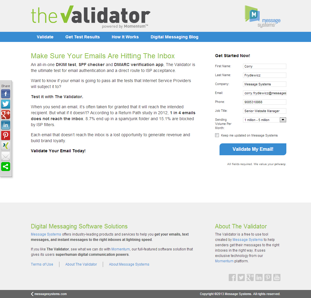
Earlier this year, we began building an email testing tool for marketers and other people who send emails out for their business. Before you assume this will help spammers get more spam gets into your inbox, I want to assure you that most of the things this tool helps with help make senders more wary of sending crap to you in the first place.
Our Goals
This tool is an attempt to introduce potential customers to Message Systems’s flagship software product Momentum. Momentum is built primarily for large companies, so it’s quite expensive. This makes it hard for them to give people a trial or demo of what Momentum can do except for in one-on-one meetings where our sales and their support staff can assist them.
So the Marketing and Engineering teams had an opportunity to fulfill a need while also creating a new way to attract traffic to the website. To recap, here are our goals in bullet form:
- Give sales team a new tool to show prospects an example of some of the things our software can do
- Increase website traffic
- Give visitors another reason to keep coming back to website after the first time
- Get some internet clout as experts in our field by offering a free resource
- Brag a bit about the power of Momentum
How It Works
Here’s a quick video we made describing The Validator and what it does:
You can give the tool a try yourself here.
Basically, here’s what you do:
- We give you an email address.
- You send an email to that address. Ideally, a marketer would send a newsletter or a promotional email here to get a real business sense of this tool’s usefulness.
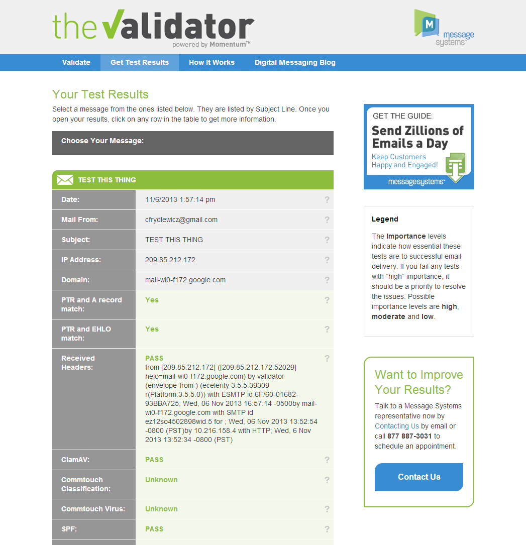
- You get a page full of results that will help you understand the strong and weak points of your email’s structure. Some of these will be based on the content of the message. Some of them will be the quality of the tool you’re using to send the message. All of it relates to how likely your message will get into your recipients’ inboxes instead of thrown into the spam folder.
The results page is probably the most important part of this tool. I designed it in a way that it allows users to get the quick answer for each test at a glance. All green means your message is awesome. Red marks mean there’s a problem that may cause your message to be flagged.
This information is useful for technical people, but most people (like me for instance) have no idea what these terms mean. Because of this, I decided to do some research of my own and explain each concept in terms that I understand as a layperson. You can find all of these explanations by clicking on the fields you’re not certain about.
If you want to dig even deeper into a concept, I included links to publications that explain at explicit detail what those terms mean and why you should care.
I feel that it’s a best practice in web UI design to allow the user to decide for themselves how far down the rabbit hole they want to go.
What I Did
I led every aspect of production except for the actual behind the scenes functionality. When the tool reached my desk it was just a button that created a randomized email address, and another button that would bring up a list of passes and fails with some supplementary technical data.
- Managed the project from the pre-production phase until its launch and marketing phase. Led production meetings, wrote and managed proposal documents, and kept the project rolling so it would beat its deadline.
- Designed the look and feel of the tool, with some help from our Graphic Designer who created the logo and gave me some creative critique along the way.
- Designed the User Experience around the idea of making it easy for anyone to use, even if they didn’t have advanced knowledge of the technology of email.
- Built the front-end to be responsive and guide the user to the next thing they want to know about their email.
- Wrote much of the copy on the website. Our professional writers went through and rewrote some of my text because they’re much better at it than I am, but I laid the framework while I built the UI.
- Helped plan the go to market strategy for launching the tool.
I didn’t do any of this stuff alone of course, but this is my portfolio section of my website, so I’m focusing on my contributions. The Validator is one of my proudest achievements at work in 2013, and I hope to be able to call the shots on more big things in the years to come.
Links:
- The Validator: http://messagesystems.com/dmarc-validator/
- Message Systems: http://messagesystems.com/
- What is DMARC? http://messagesystems.com/resources/glossary/dmarc
This article was originally posted on The Message Exchange. The original article can be found at the following URL: http://blog.messagesystems.com/behind-the-scenes-with-the-validator-a-free-email-authentication-tool/

