New WordPress Theme for 2015
As you may have noticed, I’ve released my new WordPress theme for the site. Here’s how I built it.
New Skills & Tech
I’ve learned a lot since the last theme, and I wanted to put some of that on display when I built this one. Some of the things I’ve worked on include:
- JavaScript ( AJAX, jQuery, Node.js, Grunt.js )
- SCSS (via Grunt)
- WordPress (PHP)
- CSS Animation
- Typography
- Responsive Design
- Basic SVGs ( Thanks to CSS-Tricks )
- GitHub ( https://github.com/cfrydlewicz/corry2015 )
This is my first time building a theme entirely from scratch, so it’s probably not super useful on the whole to anyone else. It’s pretty stripped-down and probably not extensible in less controlled environments. Feel free to grab it just to take bits and pieces from it of course.
Content Management
I realized that my content was mashed together pretty haphazardly all this time. I had posts about the work I was doing coming up right next to my articles about controversial topics. I had my fan fiction hobby writing posts in roughly the same pool as my game design portfolio pieces and my developer posts.
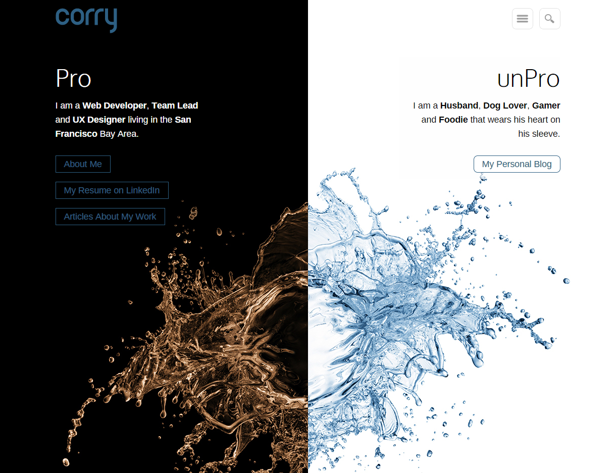
I decided that I need to go back to a style I used when I was just out of college and motivated primarily by my job search. The site is now split into dual purposes: Personal and Professional. It should be clear to users which portion of the site they’re on at all times, and it will allow people who don’t want to see some of the more controversial things I write and do to stay out of that area.
Obviously, I’m still allowing the curious to see anything they want, but I think it gives them a moment of pause to consider that they’re going into a place where they may learn very personal things about me.
Typography
I suck at typography. When I was a BFA Graphic Design major (before I transferred and switched), my typography class was based entirely on learning to use Quark for print media. We didn’t talk about pixels, RGB or how the eye views text on a screen at all. Because I only cared about being a web designer, I sort of sleep walked through that class (and still got an A somehow).
Excuses aside, I need to get better. The creative director ( she deserves that title but it doesn’t fit into our company’s org chart ) at my office has helped me learn a lot over the years.
Since most people come to my site to find my articles, I went with typography styling suited for story-telling. Even if my fiction writing isn’t the focus, I’m still telling stories in most of my posts.
Responsive Design
My Google Analytics graphs tell me that very few of my readers use mobile devices. I used to think “that means I don’t need to go responsive yet” but now I know that going responsive leads to those readers, and not the other way around.
I’ve optimized the site for phones, tablets, and desktops based on screen width because I like that I can turn my device sideways (horizontal orientation) to see the full “browser” version if I don’t like the look of that version.
Pre-Processing
I never got into pre-processing too much before because I wanted people to be able to easily view my source code if they wanted to. I wanted my clean code and comments to be visible to them. Now that I’m learning how to use GitHub finally, I can focus on performance.
It took me several tries, but I finally found a Grunt setup I like. I chose Grunt because it had everything I wanted — minification, concatenation, SCSS, and easy maintenance — plus, I could tweak it to my control-freak heart’s content. Managing a Gruntfile is pretty easy once you get the hang of it.
Learning all the pre-processors I was trying to evaluate to find my favorite led me to the sad realization that PCs kinda suck for front-end developers right now. I’m still resisting it because I’m a PC gamer and hate the idea of needing to keep two machines, but Macs simply have much easier-to-use tools for coders than PCs do.
And don’t anyone try to tell me that I can use a VM with Windows 7 on it for gaming because I’ve seen what Apple fanboys call “pretty good emulation” and it’s not good enough yet. However, I will admit that it’s getting close.
WordPress Plugins
These are the WordPress plugins I’m either keeping or adding for this theme:
- Akismet (Automattic)
Detects and removes spam comments. A godsend. - Comment Reply Notification (Denishua)
Anyone who comments on my posts will receive an email if anyone replies. I’m hoping this fosters more discussion, but much of it still stays on my FaceBook wall, which is fine too. I wish there was an easy way for me to sync FB comment threads with WordPress Comment Threads. Anyone know of one? Facebook SEO Comments
Trying this out. I don’t like how it looks, but I do like the idea of a sync between Facebook and WordPress comments. (UPDATE: I have since disabled this plugin because it just keeps breaking things.)- Google Analytics for WordPress (Yoast)
Just makes GA a little easier to see on the fly in my WP dashboard. - Search & Replace (Frank Bültge)
Because using HTML code and inline styles in your blog posts just to make certain visuals look right is a bad practice that used to be much more necessary than it is today. - Simple Lightbox (Archetyped)
Writing my own lightbox scripts has definitely not kept up with how nicely others can do it in an easy plug-in. - WordPress SEO (Yoast)
Since I started using this plugin a couple years ago, it has taught me more about SEO than many other sources. It does a ton of awesome stuff. - WP Code Prettify (Soli)
Lets me paste code snippets into blog posts and have them be decently formatted automatically. Not perfect, but not too shabby. - WP Fastest Cache (Emre Vona)
Makes editing my templates a little annoying sometimes, but it definitely helps performance.
I’ve removed a few plugins as well:
- ShareThis used to be a simple lightweight social sharing plugin, but it’s become bloated with lots of extra features I don’t need and it’s creeped into aspects of my sites that I never wanted it to (like the address bar). I’m going without a sharing widget for now, but I’ll add one once I decide how I want to handle it.
- Remove WP Tags was a simple “search and destroy” style plugin I wrote myself and never distributed. I was tired of WordPress adding elements to my posts where I didn’t want them. This script was helpful in the past but it causes a lot of unwanted side effects that require more code to fix. In the end, I decided to just accept WordPress output the way it is and build around it.
The Results
Even though you can see it all in action right now, I still like to post screen shots of the themes. This way when I update my theme again later, people will be able to look back at this post and see what the old one looked like.


At the time of this posting, I’m still making refinements to the theme. I published it early because I felt that many of the new features (namely, the responsiveness) made even the 80% finished new theme better than the finished previous one. Keep an eye on the site or the GitHub repo for new features and updates.
I hope you guys enjoy the new look. If you find it more difficult or less enjoyable to read than my previous themes, please let me know so I can make improvements. I gained a lot of new readership in the last year or so and I don’t want to alienate any existing readers with my new styling. Thanks!