
Why I Hate Coding Responsive Email Templates
[This article was published on the Message Systems Blog on May 6th, 2014.]
I wrote a post like this (with more cursing) to help explain why everyone’s emails look different to my non-HTML-knowing colleagues. Some of them found it informative and some merely found my pain entertaining. Either way, I must share the value! The challenges of coding responsive email templates are being felt by more developers every day. Recently we decided to completely overhaul our email templates to optimize them for mobile devices. Several key statistics fueled that decision, and recent studies brought them to light:
- 47% of all email is opened on mobile devices
- Emails that aren’t optimized for mobile have an 80% higher chance of being deleted
The horror of having our emails immediately deleted after all the blood, sweat and tears that went into creating them was too terrible for our marketing team to stomach. Thus, my foray into coding responsive email templates began…
Quick Aside: Marketo
Marketo email templates are awesome. They make it so that we don’t have to write every single individual email we send out in HTML code, which means I only have to code them once! This is a vast improvement over the old days. Because we use Marketo, you may see some code you wouldn’t normally see on non-Marketo templates. None of this code is affecting the styling or any of the stuff I’m going to complain about shortly.
How Browsers Show It
Below is what the coded template looks like in Chrome and in the Marketo preview. These are environments where the code is rendered accurately and consistently. Browsers are updated all the time to allow newer, cooler, more powerful coding practices over time.
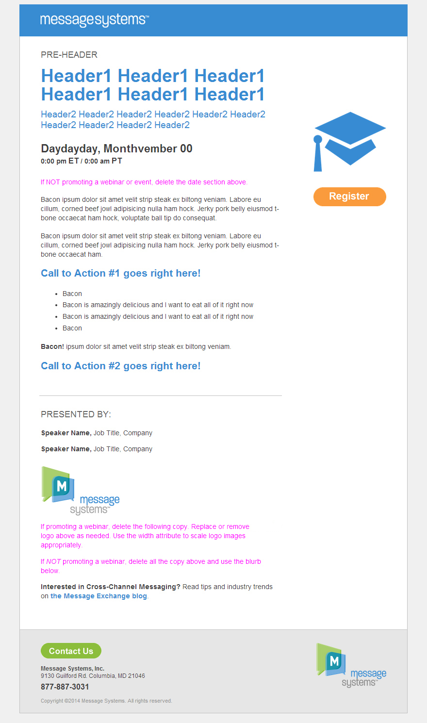
Marketo does a good job telling you if you have certain tags or styles that don’t work well in emails (like floats, padding). It doesn’t magically know what your email is supposed to look like though, so spacing, alignment, colors, hover states, [etc.] can be WAY off in some email clients and Marketo wouldn’t know to tell you. You have to keep testing and decide on a happy medium in many cases. Here’s a sample of our code from one of the templates: (you can skip this section and look at the take-aways below if you can’t read HTML)
<table id="main-column" align="left" style="margin-top:1.5rem; margin-bottom:1.6rem;">
  <tr><td style="vertical-align:top;">

    <h3 class="prehead" style="font-family:arial,helvetica,sans-serif; font-size: 1.1rem; line-height: normal; font-weight: normal; margin-top: 0px; margin-bottom:0.8rem;"><span class="mktEditable" id="pre-header">PRE-HEADER</span></h3>
    <h1 style="font-family:arial,helvetica,sans-serif; color: #378cd2; font-weight: bold; margin-top: 0px;"><span class="mktEditable" id="main-header">Header1 Header1 Header1 Header1 Header1 Header1</span></h1>
    <h2 class="subhead" style="font-family:arial,helvetica,sans-serif; font-size: 1.2rem; line-height: 1.4rem; color: #378cd2; font-weight: normal; margin-top: 0px; margin-bottom: 1.5rem;"><span class="mktEditable" id="sub-header">Header2 Header2 Header2 Header2 Header2 Header2 Header2 Header2 Header2 Header2</span></h2>

    <div class="mktEditable" id="event-date">
      <h4 style="font-family:arial,helvetica,sans-serif; font-size: 1.45rem; line-height: normal; font-weight: bold; text-transform: none; margin-top: 0px; margin-bottom: .1rem;">Daydayday, Monthvember 00</h4>
      <p style="font-family:arial,helvetica,sans-serif; font-weight: bold; margin-top: 0px; margin-bottom: 0px;">0:00 pm <span style="font-size:1rem;">ET</span> / 0:00 am <span style="font-size:1rem;">PT</span></p>
      <div style="height: 1.5rem; width: 100%;"></div>
    </div><!--#event-date-->

    <div class="mktEditable" id="copy1" style="font-family:arial,helvetica,sans-serif;">
      <p class="editor-notes"><span style="color:magenta;">If deleting everything from the date section above, also remove any code from that box in HTML mode.</span></p>
      <p class="editor-notes"><span style="color:magenta;">If deleting the second line from the date section above, be careful NOT to remove the <div> code from that box in HTML mode.</span></p>
      <p>Bacon ipsum dolor sit amet velit strip steak ex biltong veniam. Labore eu cillum, corned beef jowl adipisicing nulla ham hock. Jerky pork belly eiusmod t-bone occaecat ham hock, voluptate ball tip do consequat.</p>
      <p>Bacon ipsum dolor sit amet velit strip steak ex biltong veniam. Labore eu cillum, corned beef jowl adipisicing nulla ham hock. Jerky pork belly eiusmod t-bone occaecat ham.</p>
      <h3 style="font-family:arial,helvetica,sans-serif; font-size: 1.3rem; line-height: 1.6rem; font-weight: bold; color: #378cd2; margin-top: 1.1rem;">Call to Action #1 goes right here!</h3>
      <ul>
        <li>Bacon</li>
        <li>Bacon is amazingly delicious and I want to eat all of it right now</li>
        <li>Bacon is amazingly delicious and I want to eat all of it right now</li>
        <li>Bacon</li>
      </ul>
      <p><strong>Bacon!</strong> ipsum dolor sit amet velit strip steak ex biltong veniam.</p>
      <h3 style="font-family:arial,helvetica,sans-serif; font-size: 1.3rem; line-height: 1.6rem; font-weight: bold; color: #378cd2; margin-top: 1.1rem;">Call to Action #2 goes right here!</h3>
    </div><!--#copy1-->

  </td></tr>
</table><!--#main-column-->
Take-aways for people who can’t read HTML:
- The text formatting I’m using here includes headers (h1, h2, h3), paragraph tags (p), and Unordered Lists (ul, li). All of these tags are supported by Marketo’s email editor, and are standard HTML tags that have always existed in the language for 20+ years.
- The in-line style tags you see here are the best way to FORCE those objects to be displayed a certain way. If these don’t work, nothing will. style=”font-family:arial,helvetica,sans-serif; font-size: 1.1rem; line-height: normal; [etc.]” is defining the characteristics of that block of text for example.
- I’ve placed a couple ‘reminders’ (using the class “editor-notes”) within the template for email writers and editors. These reminders should be deleted before sending, but are hidden with CSS in case they forget.
- Like all things, lorem ipsum is better with bacon.
Now, take a look at the email’s appearance, and its code after it’s gone into Outlook Web Access:
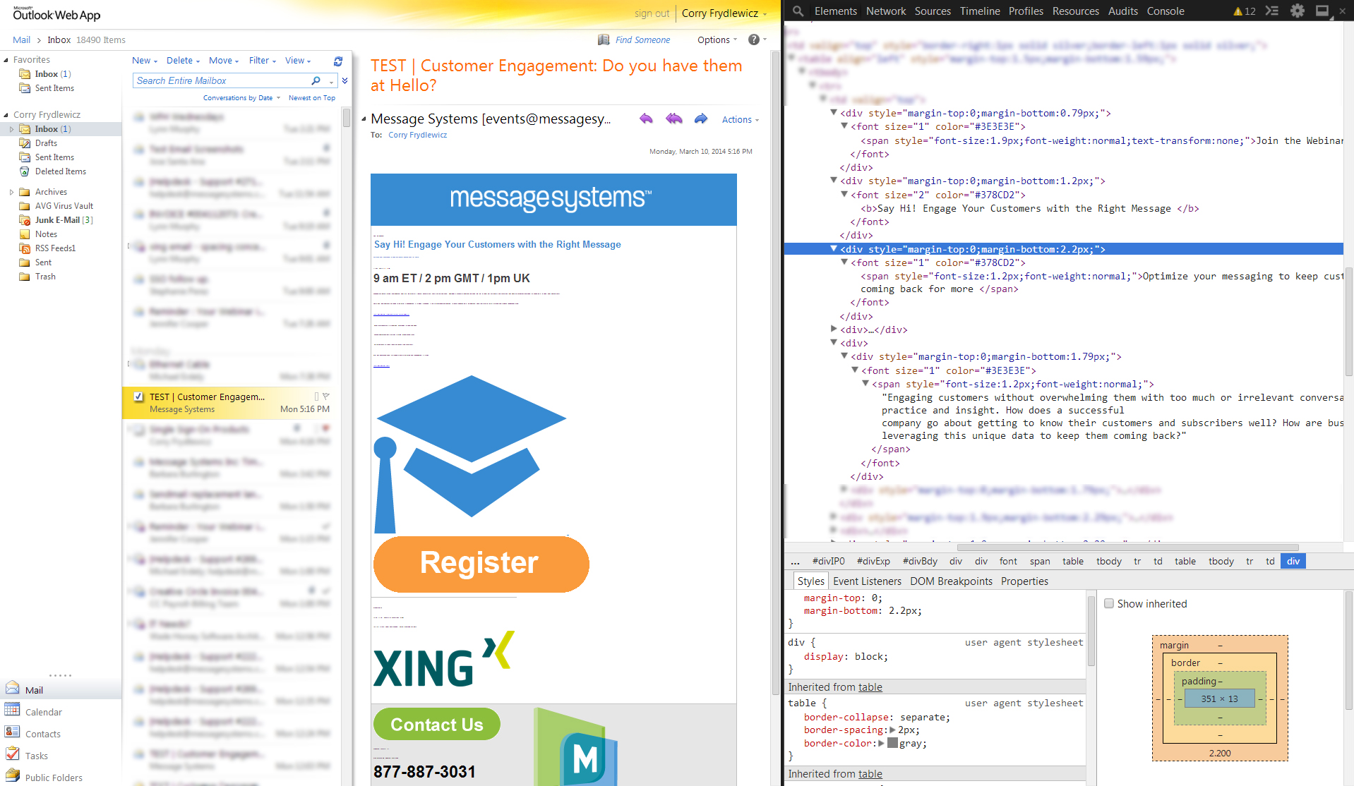
On the visual side (the email preview pane in the middle) :
- Outlook reduced most of the text to a size so small that it appears as dots.
- All the images are at their maximum size and not aligned or spaced correctly.
On the code side (the code inspector on the right) :
- Outlook removed all of my header and paragraph tags and replaced them with generic DIVs.
- Most of my highly specific inline style code has just been almost completely removed. The same is happening for the images (hence their huge size and lack of spacing).
- Outlook added unwanted tags (<span style=”font-size: xx-small;”> and <font-size=”1″> in particular) that are shrinking the text down to practically nothing. These tags are nowhere in my template.
So Outlook is effectively ignoring every attempt I make to steer the visuals of this message. Awesome.
BUT WAIT
If I double-click the message to open it in a new window…
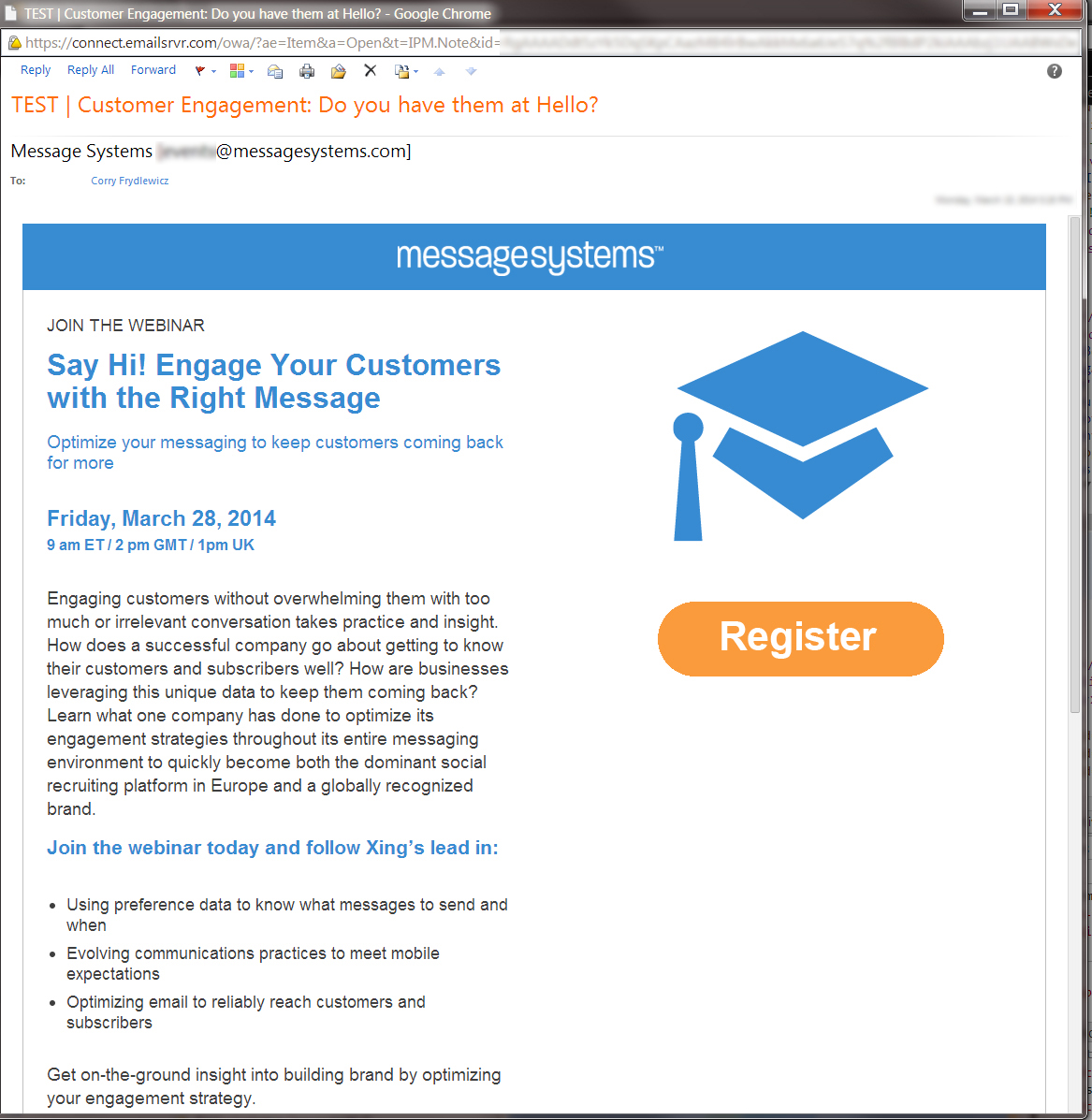
It looks mostly correct! My headers and paragraph tags are still intact! It didn’t strip out all my style code! This all seems great, but how often do you look at your emails fully opened in Outlook? I almost always only look at them in the preview pane.
This raises the questions:
- Why does Outlook Web Access sterilize (and pretty much sabotage) my code in the preview window but not in the opened version?
- How can I possibly optimize our emails to look right when the email client is ignoring and overriding my code?
- Why does Outlook Web Access look completely different from the software version of Outlook?
Email clients are not standardized as well as browsers are (and browsers aren’t perfect either). Each one decides how to interpret the same code in its own ways. For example, Gmail is the only major email client that still doesn’t allow <style> tags. Outlook doesn’t allow CSS to define a background image for some reason. Major differences like these between high market share email clients are what cause the differences in output. When the ones lagging behind in each aspect finally decide to catch up, coding email templates will be a breeze. On top of all this, these emails can look different on each individual person’s screen. My Outlook is different from my co-workers’. Even my Marketo preview looks different from one of them (and we’re both using the same OS and browser). It can be infuriating!
But I take solace…
Because our emails now look awesome on all our iPhones and Android devices.

Now we’re really walking the walk of mobile customer engagement, and not just talking the talk!
5 Responsive Email Template Tips
Luckily, I’m not a pioneer in this venture. There are tons of developers writing articles about responsive design all over the ‘net already. Some of the tips they gave me that really helped out included:
- Keep it simple. Complex layouts WILL die the moment they hit Gmail or Outlook. It’s better to keep things looking simple across the board and have them all look “good enough” on the more challenging browsers. The alternative is having your emails look amazing on one or two clients and be a massive failure elsewhere.
- Consider your viewable area while designing and writing. You may have a few paragraphs in your email, but long blocks of flat <p> text get skipped or scanned if you don’t break them up. When you view the email on an iPhone 5 for example, you don’t want to scroll too far without something pretty. An image, a quote, a header, etc.
- Don’t be too specific with your design specs. Emails in general are rarely going to end up pixel-perfect. Add in the multi-device functionality and the simplistic responsive breakpoints you’re using and nothing will ever line up perfectly. Focus on visual hierarchy and scale each element to their neighboring elements.
- Have a clear sense of the minimum and maximum specs you want to support. We opted for the iPhone 4 as our minimum spec, and a 1024 width browser window for our max. You can go lower and higher, but just make sure you don’t start designing or coding until that decision has been made.
- Use your thumb for usability testing. If your call to action is too small for your thumb to hit with precision and ease, then it needs to be bigger. The entire purpose of your email is that call to action, so if people can’t tap/click it you may lose that hit.
And that’s pretty much what you need to know when designing for responsive email templates.